
 読み込み中...
前提知識
・JSON UIの基礎がなんとなくわかる。(分からない場合は → JSON UI の備忘録【統合版】)
・何かしらの方法でUIを表示できる。(分からない場合は → 【JSON UI】自作UIをフォームで表示させる)
静的なボタン生成
今回は、静的なボタン生成の方法を解説します。
解説の流れ
① ボタン要素を用意する
② stack_panelにボタン要素を配置する
③ ボタンとボタン番号を紐づける
① ボタン要素を用意する
まずは、生成に使うボタン要素を用意します。
一からボタン要素を作るのは手間がかかるため、今回はserver_form.jsonで既に定義されている「dynamic_button」をコピーして使います。
この「dynamic_button」は、本来アクションバーのボタンとして使われているものです。
  // dynamic_button をコピペした test_button
  "test_button": {
    "type": "stack_panel",
    "size": ["100%", 32],
    "orientation": "horizontal", // 横並び
    "controls":[
      // 左のテクスチャ部分
      {
        "panel_name": {
          "type": "panel",
          "size": [34, "100%c"],
          "bindings": [
            // テクスチャがあれば表示、無ければ非表示
            {
              "binding_type": "view",
              "source_control_name": "image",
              "resolve_sibling_scope": true,
              "source_property_name": "(not (#texture = ''))",
              "target_property_name": "#visible"
            }
          ],

          "controls": [
            {
              "image": {
                "type": "image",
                "layer": 2,
                "size": [32, 32],
                "offset": [0, 0],
                "bindings":[
                  {
                    "binding_name": "#form_button_texture",
                    "binding_name_override": "#texture",
                    "binding_type": "collection",
                    "binding_collection_name": "form_buttons"
                  },
                  {
                    "binding_name": "#form_button_texture_file_system",
                    "binding_name_override": "#texture_file_system",
                    "binding_type": "collection",
                    "binding_collection_name": "form_buttons"
                  },
                  {
                    "binding_type": "view",
                    "source_property_name": "(not ((#texture = '') or (#texture = 'loading')))",
                    "target_property_name": "#visible"
                  }
                ]
              }
            },
            {
              "progress@progress.progress_loading_bars": {
                "size": [30, 4],
                "offset": [-2, 16],
                "bindings":[
                  {
                    "binding_type": "view",
                    "source_control_name": "image",
                    "resolve_sibling_scope": true,
                    "source_property_name": "(#texture = 'loading')",
                    "target_property_name": "#visible"
                  }
                ]
              }
            }
          ]
        }
      },
      // 右のボタン部分
      {
        "form_button@common_buttons.light_text_button": {
          "$pressed_button_name": "button.form_button_click",
          "anchor_from": "top_left",
          "anchor_to": "top_left",
          "size": [ "fill", 32 ], // fill: 残りの部分を全て埋める
          "$button_text": "#form_button_text",
          "$button_text_binding_type": "collection",
          "$button_text_grid_collection_name": "form_buttons",
          "$button_text_max_size": [ "100%", 20 ],
          "bindings": [
            {
              "binding_type": "collection_details",
              "binding_collection_name": "form_buttons"
            }
          ]
        }
      }
    ]
  },
これでボタンの準備が整いました。次にボタンをUIに設置します。
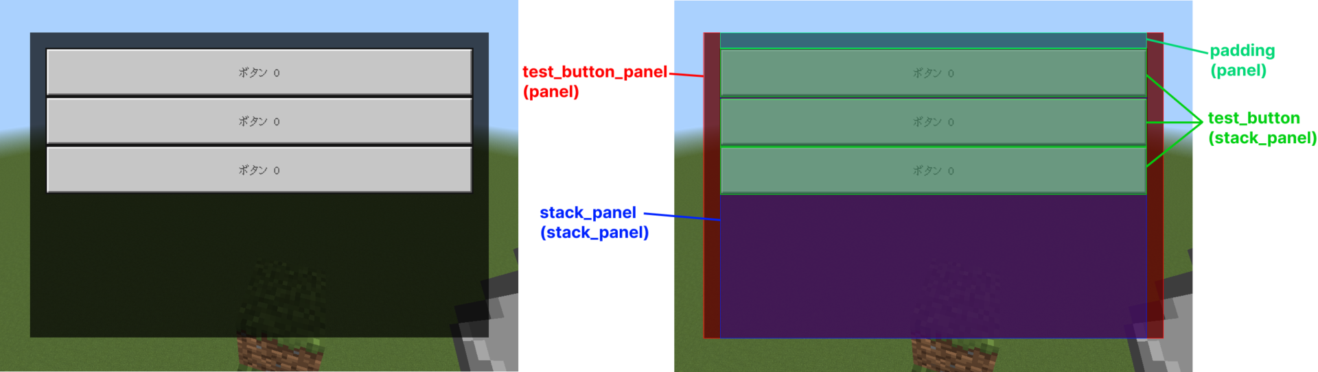
② stack_panelにボタン要素を配置する
今回は積み重なる性質を持つ、stack_panelの子要素としてボタンを配置します。
こうすることで、ボタンが縦に積み重なり、きれいに並べることができます。
  // ボタンを表示するフォーム
  "test_buttons_form": {
    "type": "panel",
    "size": [300, 200],
    "controls": [
      { // 背景
        "background": {
          "type": "image",
          "size": ["100%", "100%"],
          "texture": "textures/ui/Black",
          "alpha": 0.7
        }
      },
      { // ボタンを入れる stack_panel
        "stack_panel": {
          "type": "stack_panel",
          "size": ["100% - 20px", "100%"],
          "anchor_from": "top_middle", // 上中央
          "anchor_to": "top_middle", // 上中央
          "orientation": "vertical", // 縦に並べる
          "controls": [
            { // 10pxの余白
              "padding": {
                "type": "panel",
                "size": ["100%", 10]
              }
            },
            { // ボタン
              "test_button@server_form.test_button": {}
            },
            { // ボタン
              "test_button@server_form.test_button": {}
            },
            { // ボタン
              "test_button@server_form.test_button": {}
            }
          ]
        }
      }
    ]
  },
// 表示プログラム
const form = new ActionFormData()
.title('Test Form')
.button('ボタン 0')
.button('ボタン 1')
.button('ボタン 2');
form.show(source).then(res => {
if (res.canceled) return;
console.warn(res.selection);
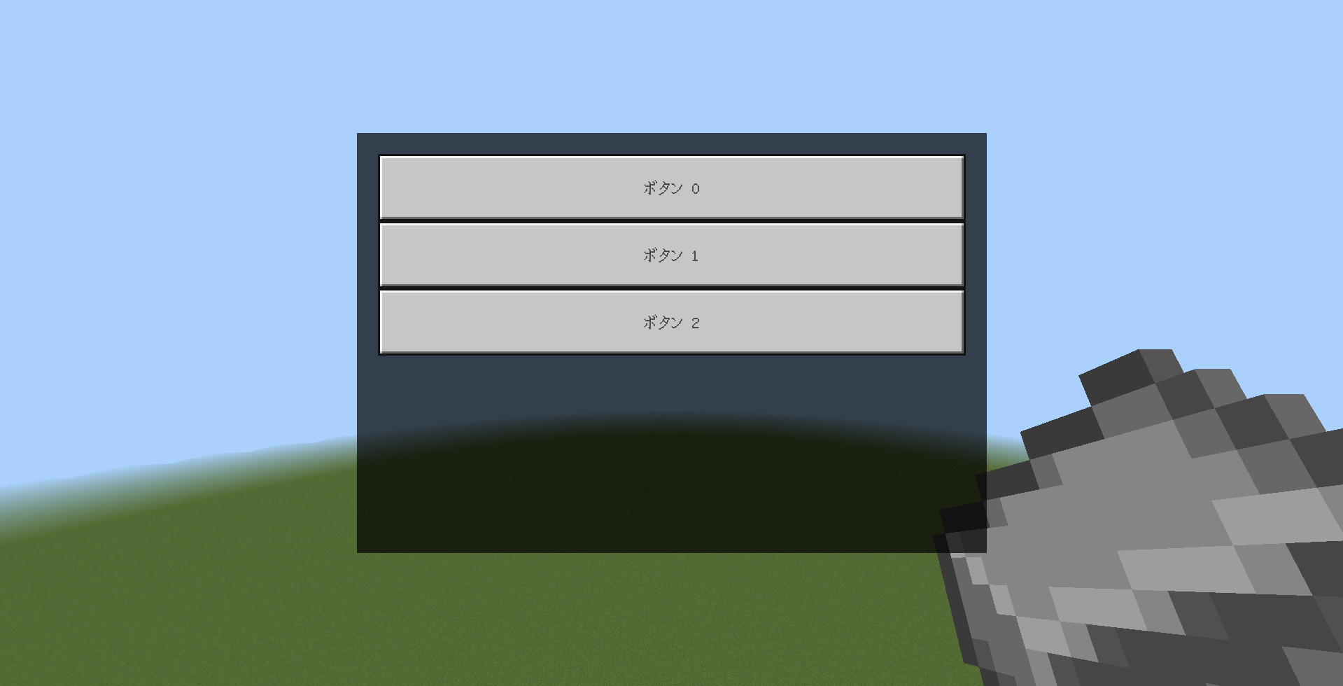
});ボタンは表示できました。
しかし、まだボタンに割り当てを行っていないため、すべてのボタンが「ボタン0」と表示されています。
この状態では、ScriptAPI側でも「0」が押されたことになります。
③ ボタンとボタン番号を紐づける
ボタンを割り当てるには「collection_name」と「collection_index」を使用します。
親要素に「collection_name」でコレクションを指定し、 子要素のボタンに「collection_index」でボタン番号を指定します。
コレクションはデータの保管庫のようなものです。
{ // ボタンを入れる stack_panel
"stack_panel": {
"type": "stack_panel",
"size": ["100% - 20px", "100%"],
"anchor_from": "top_middle", // 上中央
"anchor_to": "top_middle", // 上中央
"orientation": "vertical", // 縦に並べる
"collection_name": "form_buttons", // コレクションを指定
"controls": [
{ // 10pxの余白
"padding": {
"type": "panel",
"size": ["100%", 10]
}
},
{ // ボタン
"test_button@server_form.test_button": {
"collection_index": 0 // ボタン0 を割り当て
}
},
{ // ボタン
"test_button@server_form.test_button": {
"collection_index": 1 // ボタン1
}
},
{ // ボタン
"test_button@server_form.test_button": {
"collection_index": 2 // ボタン2
}
}
]
}
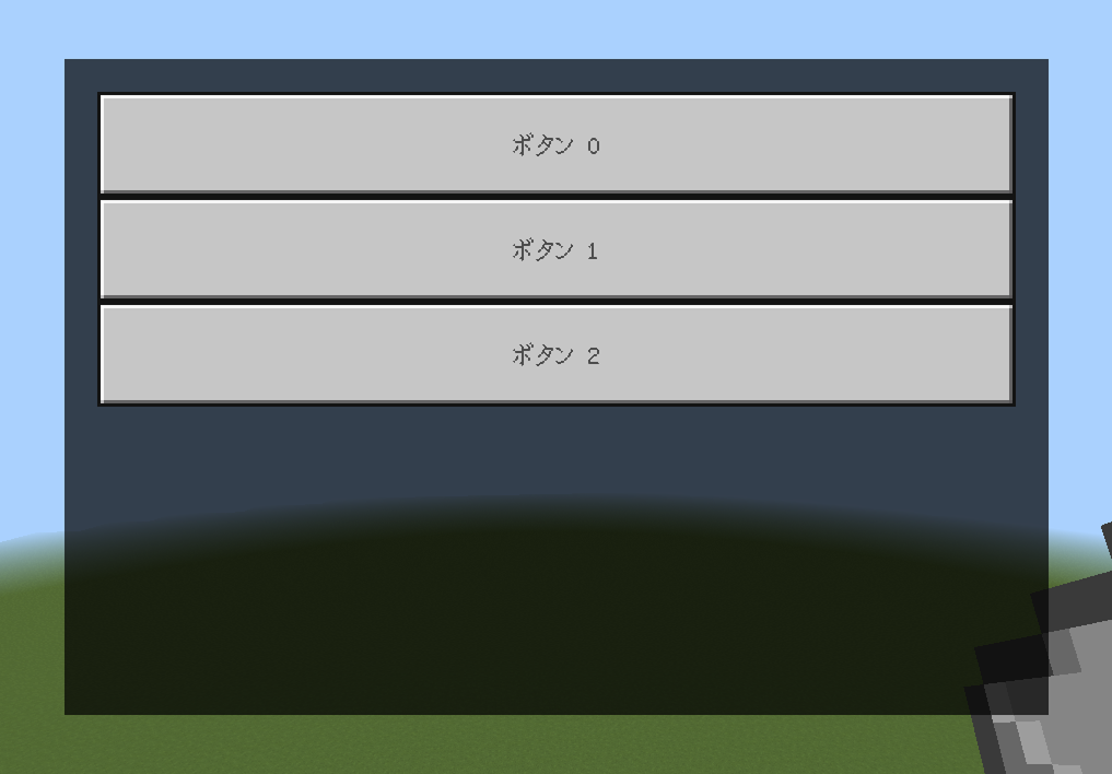
}これでボタンが割り当てられました。
ScriptAPI側でも押した番号が返ってきます。
完成品ファイル → https://drive.google.com/drive/folders/14-W51zxI8SoR4lsXXH13SMl1EEFbnoF_?usp=sharing
最後に
いかがでしたか?
今回は静的なボタン生成の方法を解説しました。
次回はボタン要素の改造か、動的なボタン生成を解説するかもしれません。
コメント
このアドオン作ってくれませんか?